Redesigning the Sales Experience to Drive Efficiency and Revenue Growth
A complete redesign of an internal sales platform to eliminate workflow friction, unify tools, and empower teams to close deals faster.
A Portal Built For The User
Sheds
Project type:
Role: Senior UX/UI Strategist
Scope: End-to-end product design, UX strategy, UI system
Platform: Web application
Timeline: 3 months
Team:
Collaboration with stakeholders, developers, and the sales team to align business goals with dealer workflows.
Project overview
Sheds dealer portal is the operational hub dealers rely on to sell inventory, manage orders, and coordinate deliveries. Over time, the portal grew into a scattered set of tools that made routine tasks harder than they needed to be, slowing down sales workflows and creating friction across day-to-day dealer operations.
I led a redesign focused on simplifying the experience around the dealer’s core jobs: tracking orders, managing inventory, and maintaining customer relationships. The result was a clearer hierarchy, consolidated workflows, and a system that supports faster decision-making on both desktop and mobile.
My role:
As lead UX/UI designer on the project, I was responsible for defining the structural direction of the portal redesign. I worked with stakeholders to identify workflow pain points, prioritize dealer needs, and restructure the system around how orders, inventory, and customer relationships actually function in practice.
My role extended beyond interface design. I shaped the information architecture, simplified navigation, and established patterns that guided both the desktop and mobile experiences. This ensured the final product wasn’t just visually updated, but fundamentally easier for dealers to use in their daily operations.
Stakeholder Alignment
Translated a sprawling wishlist of 20+ features into a focused, prioritized interface that addressed real dealer pain points.
IA Consolidation
Reduced navigation from 20+ scattered items to a clean, grouped hierarchy — combining Order Management, Cash Payments, and Signed Docs into unified views.
End-to-End Redesign
Delivered high-fidelity designs for Dashboard, Order Management, Inventory, and Customers, all supporting views with interactive prototypes.
The Challenges
Fragmented Systems Slowing Sales Performance
The existing sales portal lacked structure, clarity, and efficiency. Critical tools and data were fragmented across multiple touchpoints, forcing sales teams to navigate disjointed workflows to complete simple tasks. This created friction in day-to-day operations, slowed down decision-making, and introduced unnecessary complexity into the sales process. In a fast-paced sales environment, inefficiency directly impacts speed, performance, and revenue.
Objectives
Streamline core sales workflows to reduce friction
Centralize tools and data into a unified experience
Improve clarity and usability for high-frequency users
Design a scalable system to support future growth
Navigation Overload
20+ sidebar items with no grouping. Signed Documents, Cash Payments, Dealer Feedback, and Order Files all lived at the same level as core functions.
Duplicated Functionality
Order-related data was spread across Order Management, Cash Payments, Order Files, and Signed Documents, requiring dealers to check multiple pages for a single order.
UX Strategy
Rather than approaching this as a visual redesign, the focus was on restructuring the underlying experience to align with how sales teams actually work.
No Mobile Consideration
Dealers in the field needed quick access to Customers, Inventory, and Order Management on mobile. The legacy portal was desktop-only.
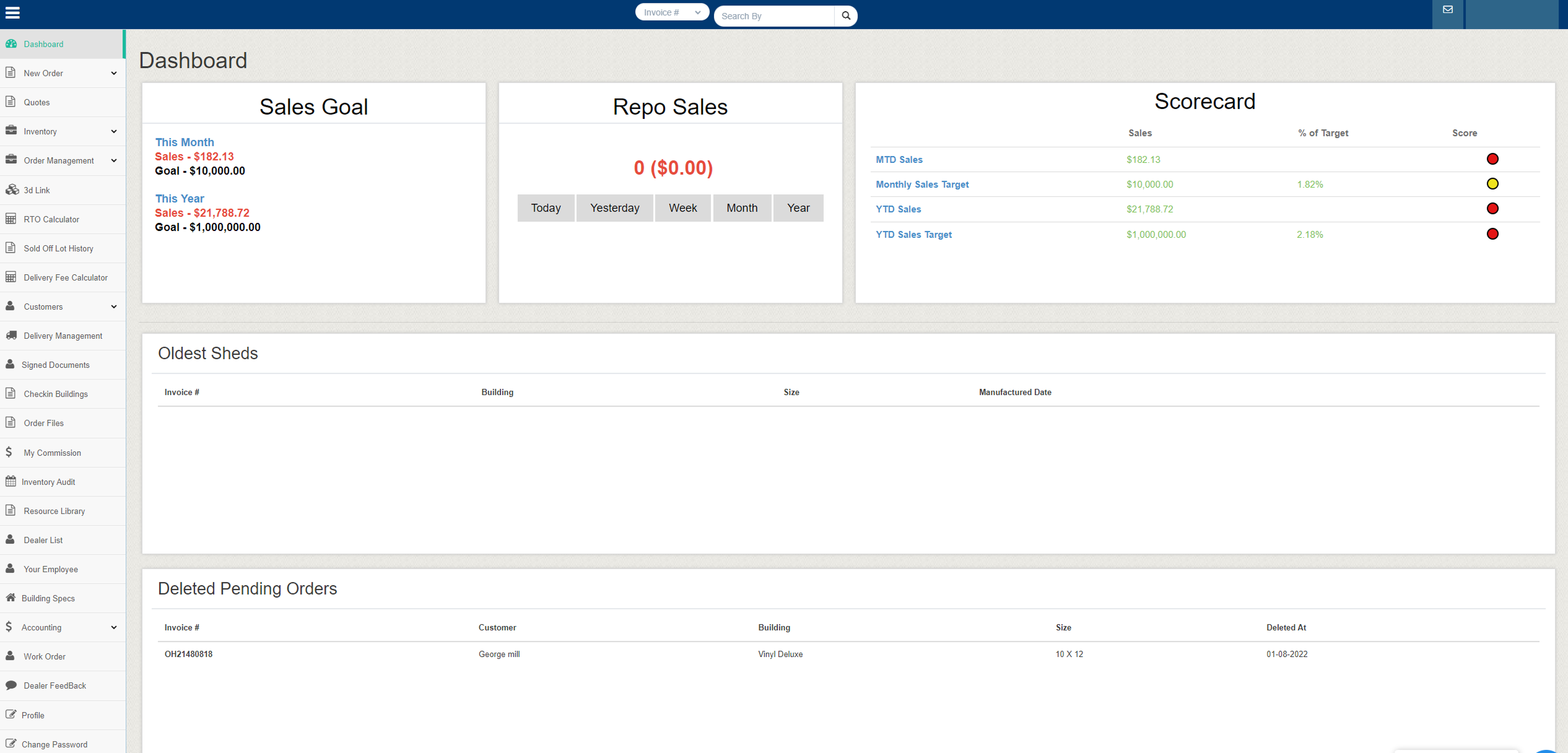
The Legacy Portal
Before: Dashboard
The existing platform had grown around internal processes rather than user behavior, resulting in a cluttered interface that made routine tasks slower and harder to complete. Critical workflows like ordering, inventory management, and commissions were fragmented across the system, increasing friction for dealers and internal teams alike.
UX Research
Balancing Stakeholder Wants vs. UX Best Practices
Stakeholders had a clear vision of what they wanted, every feature visible, every metric on screen. My job was to honor those goals while applying UX principles that would actually improve dealer efficiency and satisfaction.
What Stakeholders Wanted
- Sales Goal box front and center
- Scorecard with traffic-light ranking dots
- Every order type visible in navigation
- All delivery and document tracking accessible
- Dealer feedback section
What UX Research Revealed
- Dealers check 3 things daily: Orders, Inventory, Customers
- Signed Docs tracking should live within Order status
- Cash Payments are just another order filter, not a separate section
- Dealer Feedback had near-zero engagement = deprioritize
- Mobile access was the #1 unspoken need
- A smart dashboard eliminates 60% of navigation clicks
Information Architecture
From 20+ Items to a Clear Hierarchy
The restructured navigation groups related functions and eliminates redundancy, reducing cognitive load while maintaining full functionality.
Orders
- New Orders
- Order Management
- Order Files
- RTO Calculator
- Sold Off Lot History
- Work Order=
Inventory
- Inventory Management
- Inventory Audit
- Building Specs
- Check-in Buildings
Customers
- Customer Management
- Delivery Management
- Signed Documents
- Delivery Fee Calculator
- Dealer List
- Your Employee
- Resource Library
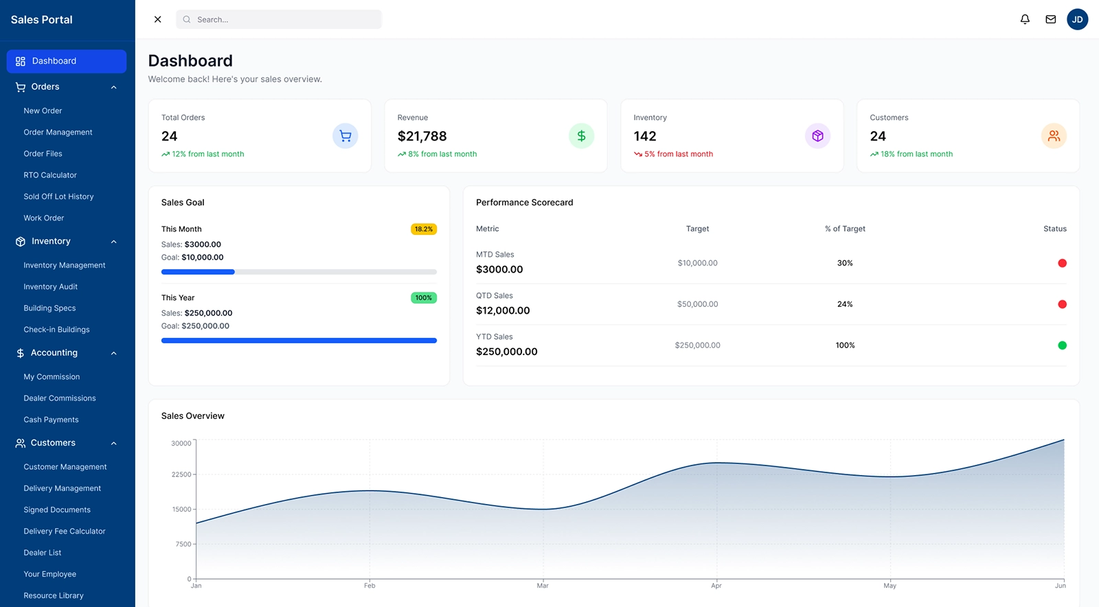
The Solution
After: A Dashboard That Works
The redesigned dashboard surfaces Sales Goals with visual quota indicators, a Sales Rep Leaderboard for motivation, Inventory Turns for real-time stock awareness, and a Score Card chart for performance tracking over time.
Unified Order, Inventory, and Customer flow
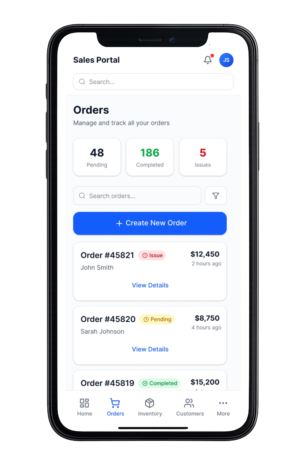
The orders view was redesigned to give dealers immediate clarity into sales activity and potential issues. Status summaries surface pending, completed, and problematic orders at a glance, while the streamlined list allows dealers to quickly review details or take action without navigating through multiple tools. This supports faster decision-making and keeps revenue-generating work front and center.
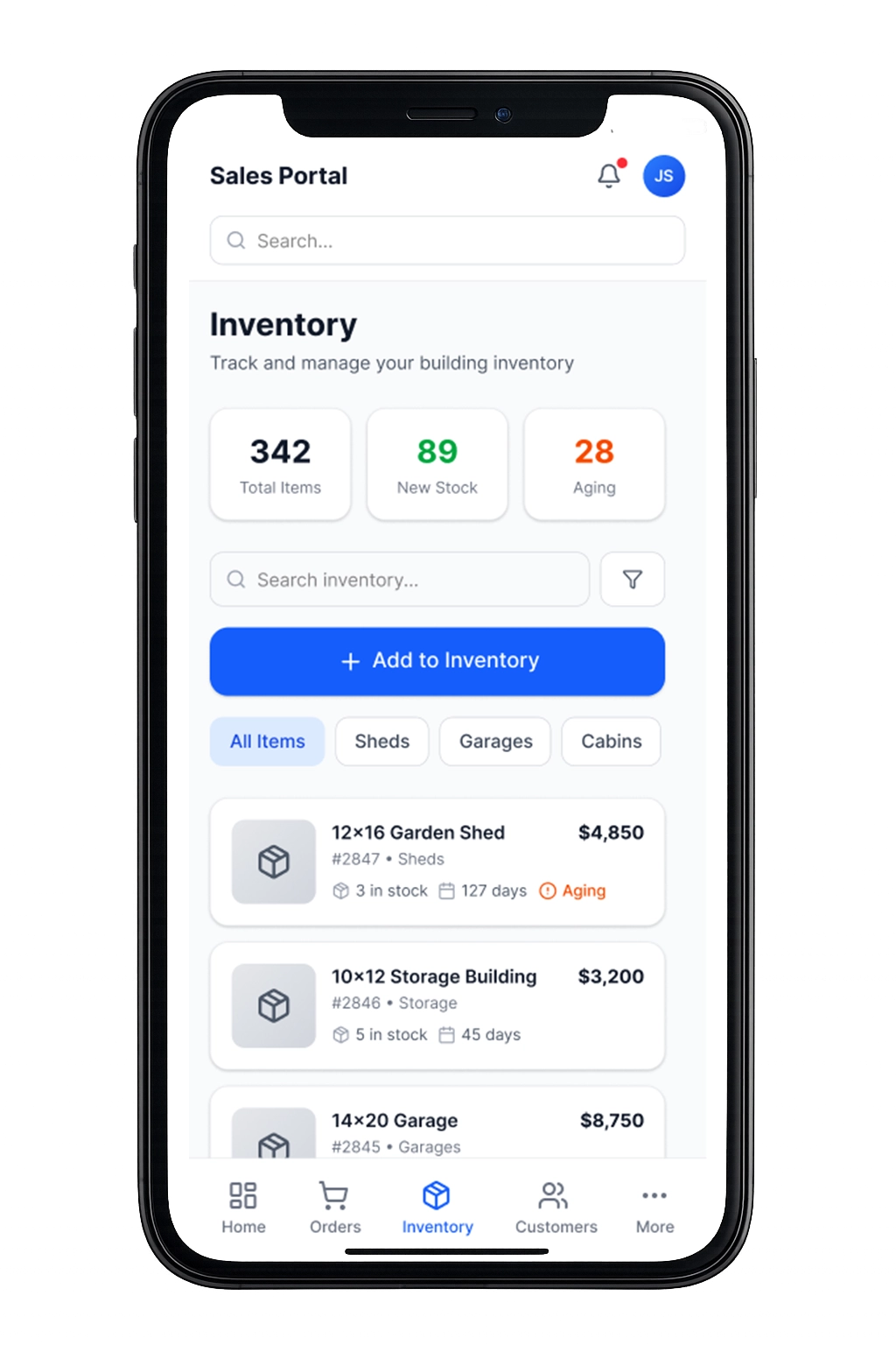
Inventory was structured to highlight availability, aging stock, and new additions in a single, digestible view. Dealers can quickly filter building types, monitor how long units have been sitting, and add new inventory without leaving the workflow. This improves lot management and helps dealers prioritize which units to move first.
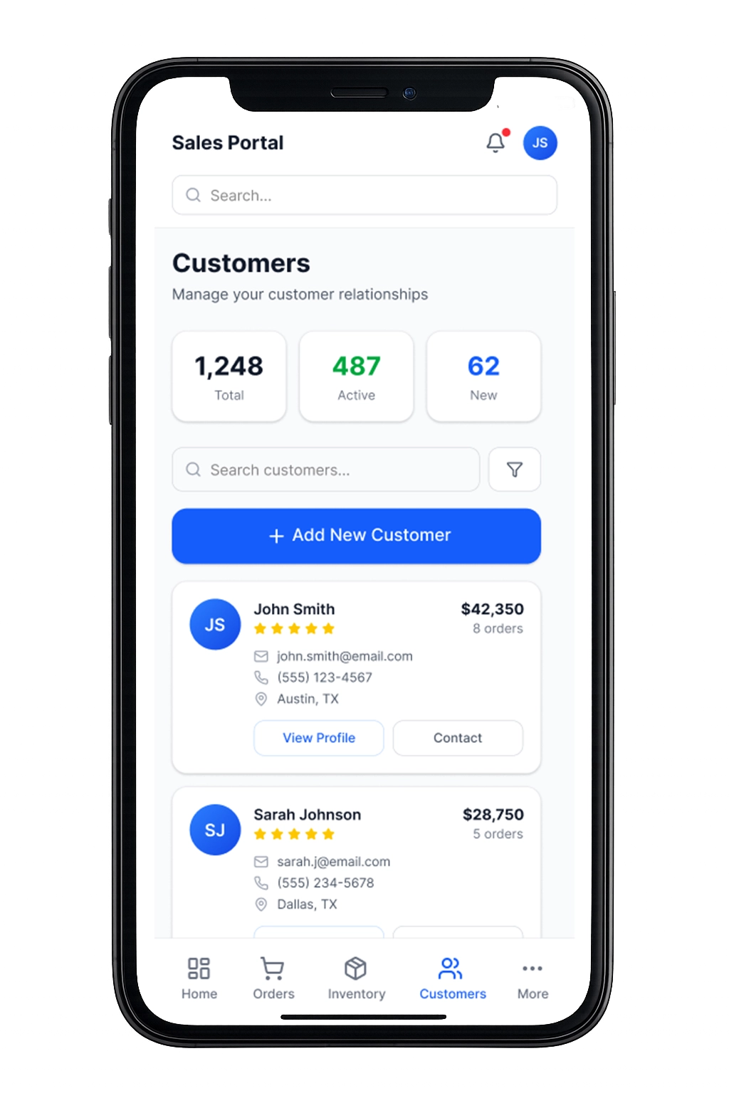
The customer dashboard consolidates contact details, purchase history, and account value into one view, reducing the need to cross-reference external records. By surfacing order totals and engagement status alongside contact information, dealers can better manage relationships and focus follow-ups where they have the greatest impact.
Results & Impact
What The Redesign Achieved
60%
Fewer Menu Items
Reduced navigation complexity so dealers can locate core tasks faster and spend less time searching for tools.
4→1
Design Consolidation
Merged overlapping workflows into a single system, eliminating duplicate entry points and reducing operational confusion.
6-Step
Order Flow
Streamlined the ordering process into a clearer, more predictable path that helps dealers complete transactions with fewer interruptions.
3 Key
Mobile Views
Focused the mobile experience on the most critical dealer actions—orders, inventory, and customers—ensuring the portal remains usable in the field as well as at the desk.
Reflection & Key Takeaways
What I learned, what worked, and what I’d do next
This project reinforced that effective product design isn’t about adding features but rather clarifying priorities. By restructuring the portal around how dealers actually manage orders, inventory, and customers, the system became easier to navigate, easier to scale, and better aligned with the business itself.
It also highlighted the importance of balancing stakeholder requests with long-term usability. The most impactful improvements came not from adding new functionality, but from simplifying the structure so dealers could focus on the work that drives their business forward.
What Worked
Framing every stakeholder request through the lens of ‘how does this help the dealer’s daily workflow’ turned feature debates into productive prioritization sessions.
Key Tradeoffs
Removing Dealer Feedback and deprioritizing some features required trust-building with stakeholders. Showing engagement data made the case objectively.
Looking Back
With the redesigned portal live, I’d continue with analytics-driven iteration — tracking which dashboard widgets get the most interaction and refining the mobile experience based on field usage patterns.
Explore More

Designing Clarity at Scale
UX Design | Marketing & Sales | Events
View All Work
UX Design | Graphics | Motion | Video | Events