Enterprise
Making Critical Information Instantly Accessible
Rebuilt a fragmented content system into a fast, intuitive experience for finding critical information
Enterprise
Making Critical Information Instantly Accessible
Rebuilt a fragmented content system into a fast, intuitive experience for finding critical information
Enterprise Corporation
Project type:
- UX/UI Web Design
- IA/Sitemap
- Wireframe
- Development
Timeframe:
6 Months
Project overview
The SERC website redesign was a large-scale UX initiative focused on restructuring a fragmented content ecosystem spanning 100+ pages and thousands of documents.
The primary goal was simple: help users find the right information fast, especially meeting notes, reports, and compliance resources, then get out without friction.
My role:
Led end-to-end UX and UI design for a 100+ page website redesign on the Synchronicity team, partnering with project management, developers, and a stakeholder committee to restructure complex information architecture, define a scalable design system within brand guidelines, and support WordPress implementation. Focused on improving content discoverability, reducing time to task, and enabling users to quickly navigate thousands of documents and meeting notes.
The Challenge
The existing experience was fragmented, inconsistent, and difficult to navigate.
A fragmented content system made it difficult for users to locate documents, meeting notes, and critical information across 100+ pages. Poor labeling, inconsistent structure, and scattered content created friction at every step of the user journey.
Disorganized Content & Structure
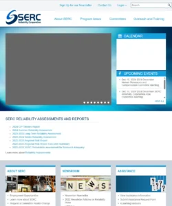
Content was scattered across disconnected pages with no clear hierarchy. Documents and meeting notes were often mislabeled or inconsistently categorized, making it difficult for users to understand where information lived or how sections related to one another.
Problem Areas:
- Content spread across 100+ pages with no clear hierarchy
- Thousands of documents and meeting notes lacked consistent organization
- Mislabeling and inconsistent categorization across sections
- Redundant and overlapping content created confusion
- No scalable structure to support ongoing content growth
High Cognitive Load & Inefficient Navigation
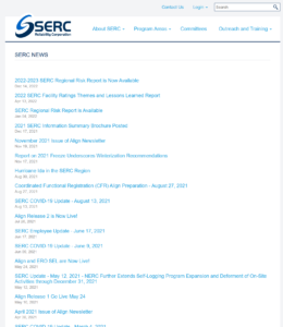
Users were forced to navigate too many unclear options with little guidance. The experience didn’t align with user expectations, increasing cognitive load and slowing time to task. Instead of quickly finding what they needed, users had to search, guess, and navigate multiple paths to locate critical information.
Problem Areas:
- Too many entry points with little guidance, leading to choice overload
- Navigation did not align with user expectations or mental models
- Users forced to guess where content might live
- Multiple steps required to locate a single document or meeting note
- Slowed time to task and increased user frustration
UX Strategy & Reasearch
Strategic Foundation for Clarity
With a content-heavy ecosystem and task-driven users, the focus was on reducing friction and improving speed to information. A full content audit revealed gaps in structure, labeling, and categorization across 100+ pages and thousands of documents. Card sorting and IA modeling aligned content to user mental models, while simplified navigation and clear hierarchy reduced cognitive load and improved overall usability.
Key Features:
- Reduce time to task for locating documents and meeting notes
- Restructure information architecture to align with user mental models
- Improve content discoverability through clear categorization and labeling
- Minimize cognitive load with simplified navigation and hierarchy
- Create a scalable system to support ongoing content growth
Information Architecture
Architecting a Scalable Content System
To solve the core usability issues, the information architecture was completely restructured across 100+ pages and thousands of documents. The focus was on creating a scalable, intuitive system that aligns with how users search for and access information.
Audit & Breakdown
- Full audit of pages and documents
- Identified redundancies, mislabeling, fragmentation
- Mapped content relationships
Restructuring the System
- Card sorting + tree structuring
- Defined clear hierarchy (parent/child relationships)
- Consolidated and reorganized content
- Established consistent taxonomy
Designing for Scale & Findability
- Built a system that supports thousands of documents
- Standardized structure across all sections
- Improved navigation predictability
- Enabled easier content management moving forward
Information Architecture
Architecting a Scalable Content System
To solve the core usability issues, the information architecture was completely restructured across 100+ pages and thousands of documents. The focus was on creating a scalable, intuitive system that aligns with how users search for and access information.
Audit & Breakdown
- Full audit of pages and documents
- Identified redundancies, mislabeling, fragmentation
- Mapped content relationships
Restructuring the System
- Card sorting + tree structuring
- Defined clear hierarchy (parent/child relationships)
- Consolidated and reorganized content
- Established consistent taxonomy
Designing for Scale & Findability
- Built a system that supports thousands of documents
- Standardized structure across all sections
- Improved navigation predictability
- Enabled easier content management moving forward
Key Features:
Design System & UI
Creating a Cohesive User Experience
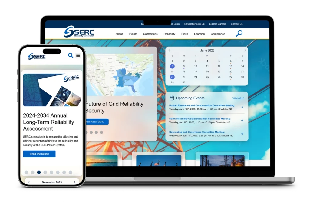
A structured UI system was developed to support a content-heavy experience, ensuring consistency, clarity, and scalability across 100+ pages.
Visual Hierarchy & Content Clarity
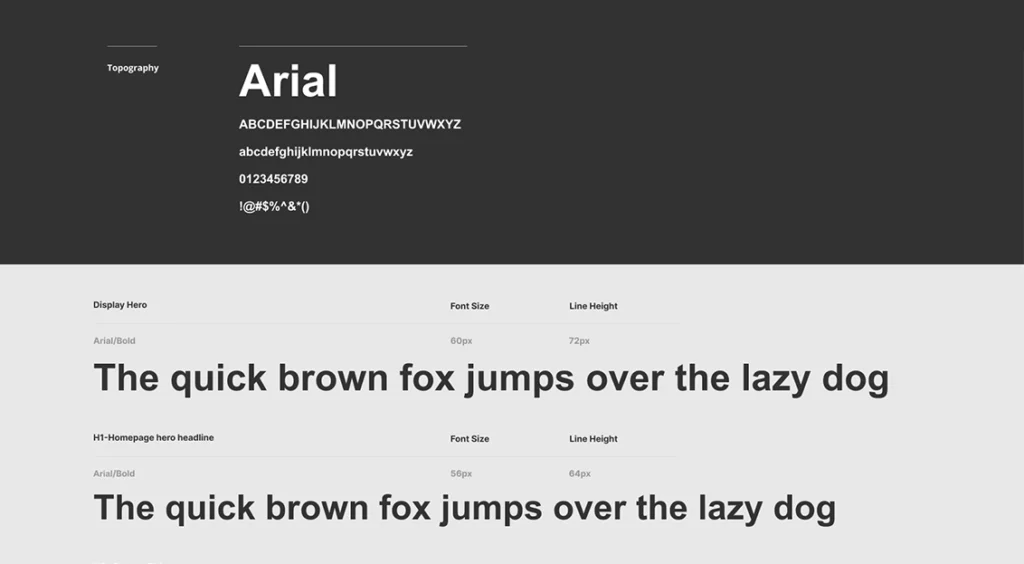
Designed for fast scanning and clear content prioritization across complex pages.
- Strong typographic hierarchy to organize dense information
- Clear separation of sections and content groupings
- Layouts optimized for readability and quick scanning
Component System & Consistency
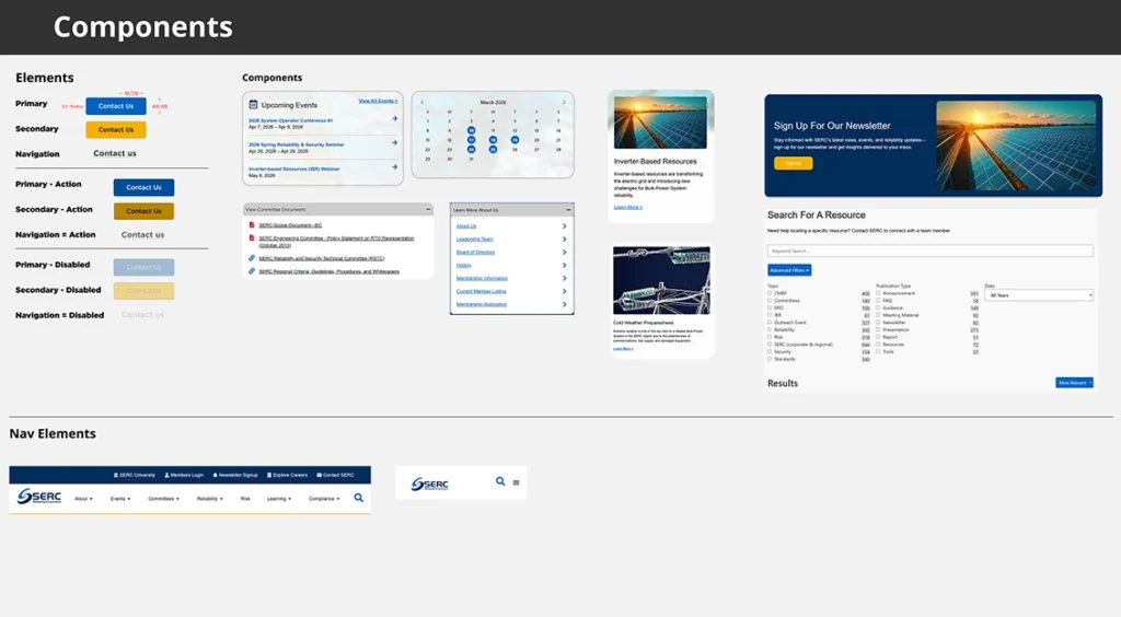
Reusable components created to ensure consistency and support scalability.
- Standardized components used across all page types
- Flexible patterns for documents, resources, and structured content
- Built to scale with ongoing content growth and system expansion
Navigation & Responsive Experience
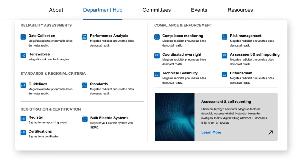
Predictable navigation and responsive design to reduce friction across devices.
- Consistent navigation patterns aligned with user expectations
- Clear pathways between related content and sections
- Optimized for mobile with improved spacing, hierarchy, and usability
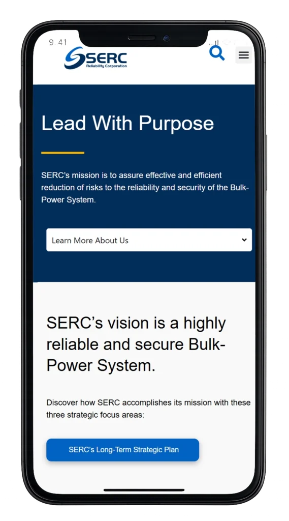
Mobile Experience
Optimized for Mobile Access
With users accessing documents and information on the go, the experience was designed to maintain clarity and usability across smaller screens without sacrificing functionality.
Key Features:
- Simplified navigation to reduce friction on smaller screens
- Optimized content hierarchy for fast scanning and readability
- Improved spacing and tap targets for accessibility
- Maintained consistency between desktop and mobile experiences
- Ensured critical documents and resources remained easy to access

Impact & Outcomes
From Fragmented to Functional
The redesigned experience transformed how users access and navigate critical information across the site. By restructuring the information architecture and simplifying navigation, the platform now supports faster access to documents, clearer content pathways, and a more efficient overall user experience. What was once fragmented and difficult to navigate is now structured, intuitive, and built to scale for both users and internal teams.
Key Outcomes
- Improved content discoverability across all major sections
- Reduced time to task for locating documents and meeting notes
- Clearer navigation aligned with user expectations
- More intuitive structure for complex content and resources
- Scalable information architecture to support ongoing growth
- Reusable UI components for consistency across 100+ pages
- Easier content management and organization for internal teams
Refection & Key Takeaways
Designing Systems, Not Just Screens
This project reinforced the importance of approaching large-scale platforms as systems, not individual pages. Success came from aligning structure, usability, and scalability to support both user needs and long-term growth.
What Worked
A system-first approach to information architecture and UI design created clarity across a complex ecosystem. By aligning content structure with user mental models and simplifying navigation, the experience became more intuitive and efficient.
- Strong IA reduced friction across 100+ pages
- Clear hierarchy improved content discoverability
- Consistent UI patterns reinforced usability and trust
Key Tradeoffs
Balancing simplicity with depth required careful prioritization. While reducing complexity improved usability, it also meant consolidating content and limiting certain pathways to maintain clarity.
- Simplified navigation required removing redundant or overlapping content
- Prioritized structure over edge-case flexibility
- Balanced stakeholder needs with user-first decision making
Looking Back
With more time, deeper user testing and search optimization could further enhance the experience. Expanding filtering capabilities and refining content governance would continue improving long-term scalability.
- Opportunity to enhance search and filtering across large datasets
- Further validation through user testing and analytics
- Continued evolution of content strategy and governance
Explore More

Designing Clarity at Scale
UX Design | Marketing & Sales | Events
View All Work
UX Design | Graphics | Motion | Video | Events