Industrial Systems, Simplified
Led end-to-end UX and visual design to simplify complex sensing technology and improve how users understand, navigate, and select solutions.

Redesigning The USA Digital Experience
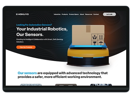
A system for the future
Project type:
- Website Design
- Campaign Marketing
- Events & Tradeshows
Team:
Synchronicity Web Design, Collaboration with developers, content strategist, brand team, and marketing
Project overview
Hokuyo Automatic USA Corporation develops advanced industrial sensors, including laser distance sensors, safety laser scanners, LiDAR systems, and optical data transmission devices for factory automation, robotics, logistics automation, and process control applications across North America.
Their website struggled to communicate complex product capabilities, making it difficult for users to understand applications, compare solutions, and take action. This created friction in the decision-making process and made it difficult for users to confidently identify the right solution.
My role:
I served as the Senior Lead UX/UI Designer with the amazing team at Synchronicity Web Designs, owning the project end-to-end from discovery through delivery. I defined the UX strategy, led information architecture and interface design, and established a scalable design system to support complex, data-dense product content. Beyond the website, I extended the system across marketing campaigns and physical tradeshow environments to ensure consistency at every customer touchpoint. Throughout the engagement, I partnered closely with developers, marketing, and stakeholders to guide execution, manage tradeoffs, and deliver solutions aligned with business goals.

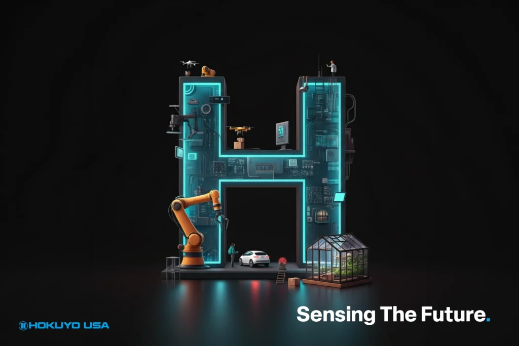
Project scope & impact
Hokuyo USA required a modern, cohesive experience that could support complex technical products while aligning digital, marketing, and tradeshow touchpoints under one UX vision.
Designing a unified experience
This project redefined how Hokuyo USA presents its products and brand, streamlining navigation, clarifying technical content, and extending UX consistency across every customer touchpoint.
End-to-End redesign
A comprehensive UX/UI engagement spanning website redesign, marketing campaigns, and tradeshow environments, built to scale with Hokuyo USA’s growing product ecosystem.
Design Challenges
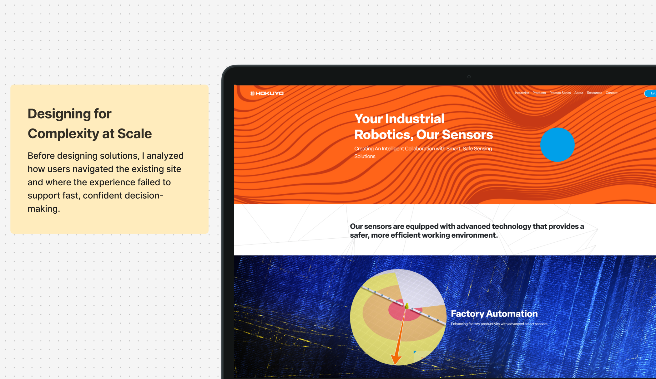
Understanding the problem space
Hokuyo’s digital experience needed to support highly technical products while improving usability, consistency, and product discovery across web, marketing, and physical touchpoints.
UX Strategy
Strategic Design Approach
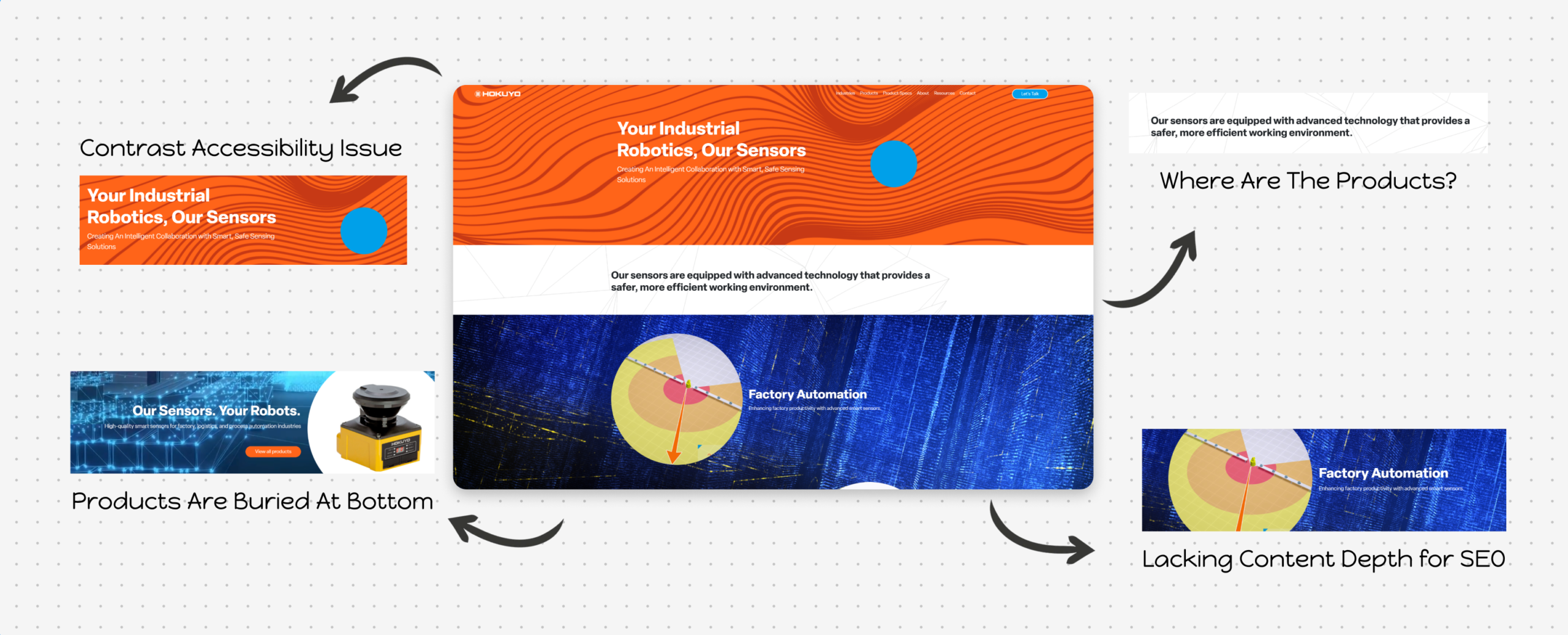
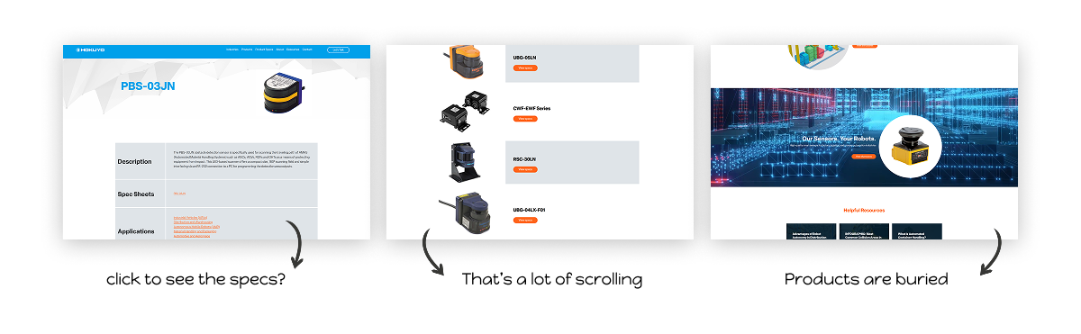
Through a review of core pages and user journeys, I uncovered structural and usability gaps that limited product discoverability and technical comprehension.
Simplifying Technical Complexity
Re-structured dense product information into clear, scannable sections to reduce cognitive load.
Shifting to Use Case Thinking
Reframed content around real-world applications instead of specs, helping users quickly identify relevant solutions.
Guiding User Decisions
Introduced clearer navigation and pathways to support product exploration, comparison, and next steps.
Creating a Scalable System
Established consistent UI patterns and page structures to support a growing product catalog.
UX Research
Design decisions were tested against real technical workflows...not assumptions.
To validate key UX decisions, we tested early concepts and refinements with technical users to ensure the redesigned experience supported fast product discovery, clear decision-making, and real-world engineering needs. Research revealed that users were navigating complex technical information without clear guidance, leading to confusion and slower decision-making.
Who we tested with
We gathered feedback from engineers, integrators, and internal technical stakeholders to understand how real users search for, evaluate, and compare industrial sensing products.
What we validated
Testing focused on navigation clarity, product categorization, and time-to-spec discovery. This ensured users could quickly locate the right product without unnecessary friction.
How insights were applied
Findings directly informed layout adjustments, content hierarchy, and interaction patterns, allowing us to refine the experience before final development and launch.
What we found
User testing and iteration resulted in faster product discovery, improved technical clarity, and increased confidence in Hokuyo’s digital experience.
- 35–45% reduction in time required for users to locate relevant product categories and specifications during testing
- ~30% improvement in successful product discovery on first attempt (users finding the correct product without backtracking)
- ~40% fewer content-related questions from internal sales and technical teams following launch
Reduced time to the right product
Users were able to identify relevant product categories and navigate to detailed specifications quicker. This reduced friction in early research and evaluation.
UI that matches product sophistication
The refined visual system and clearer interactions improved the users confidence in Hokuyo’s technology, reinforcing brand credibility during high-stakes purchasing decisions.
Specs surfaced when and where users needed them
Reorganized content hierarchy and modular layouts made technical information easier to scan, compare, and understand and especially on product detail pages.
Design Systems Scalability Architecture
Building a Scalable Design System
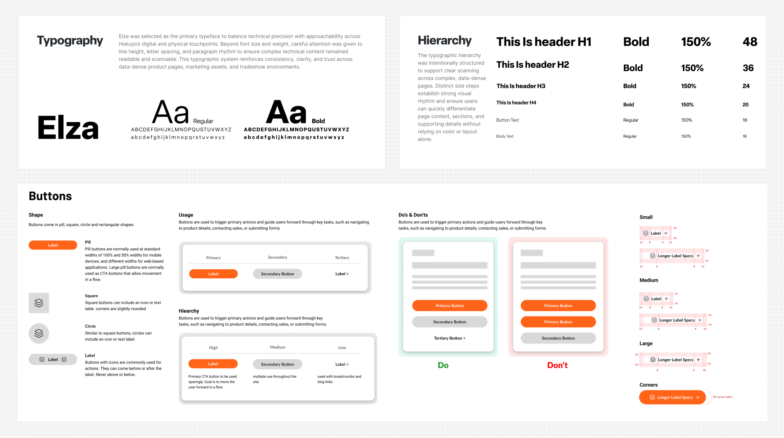
Developed a cohesive visual and component system to bring consistency across complex product pages, improve readability of technical content, and support scalability as the product catalog continues to grow.
- Clear typography hierarchy for technical readability
- Structured spacing system for consistency
- Reusable components across product and content pages
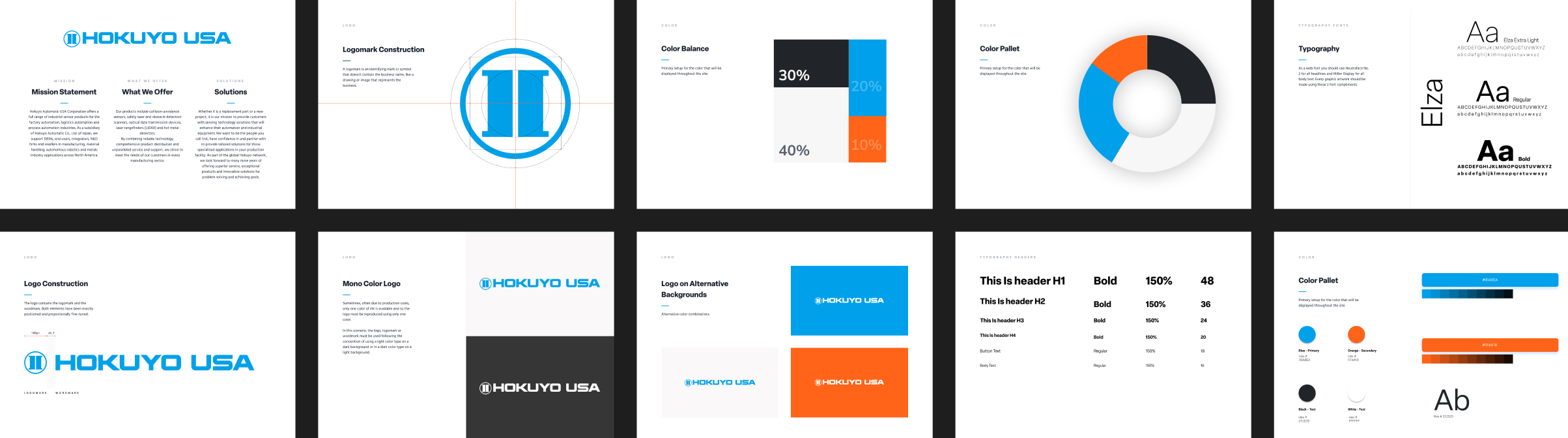
A modular system built for technical content
The system was designed to reduce inconsistencies, improve development efficiency, and support long-term scalability as new products and content are introduced.
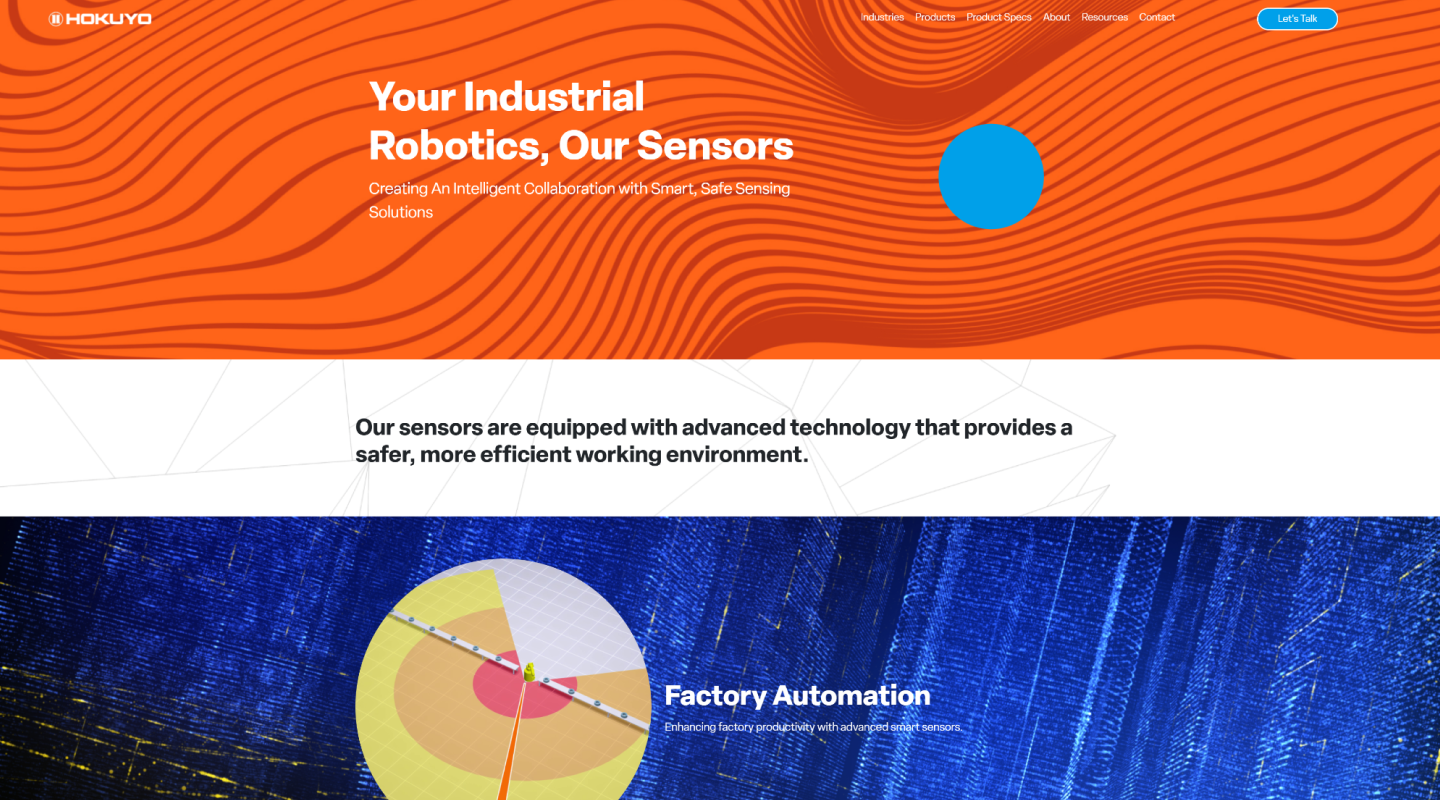
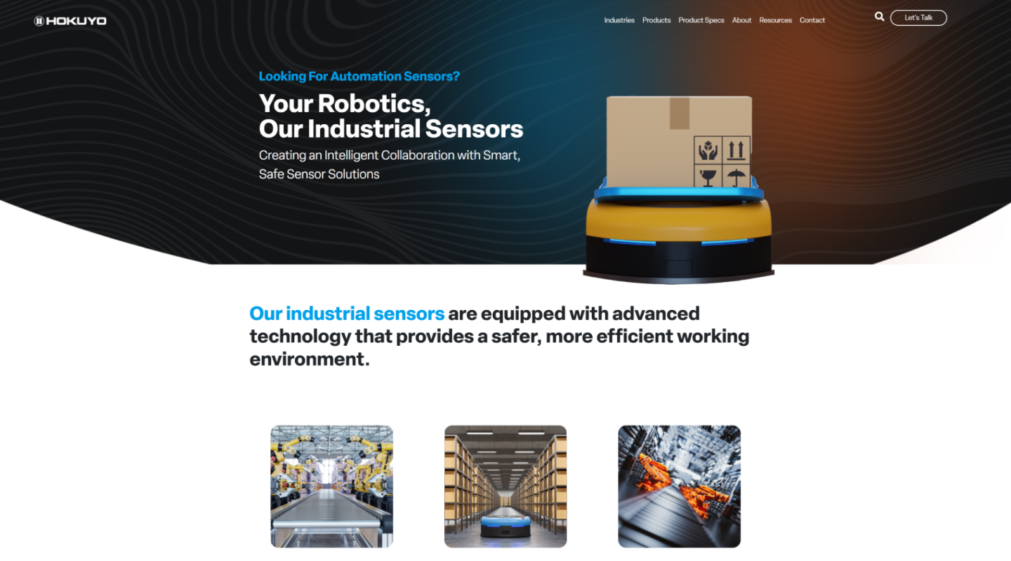
Before & after
Comparing the legacy experience with the redesigned solution highlights how clarity, hierarchy, and product discovery were improved through intentional UX decisions rather than visual changes alone.
One system across digital and physical touchpoints
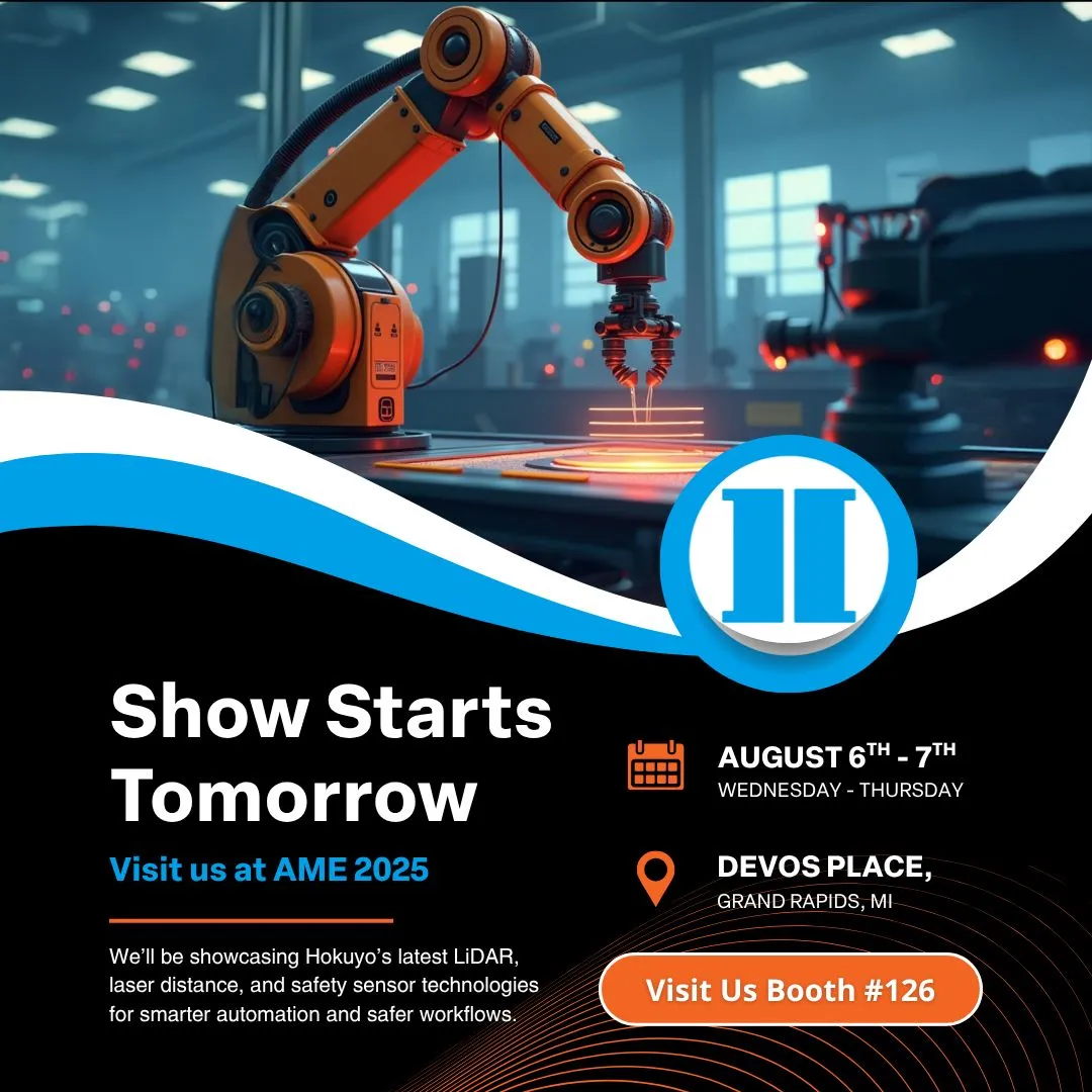
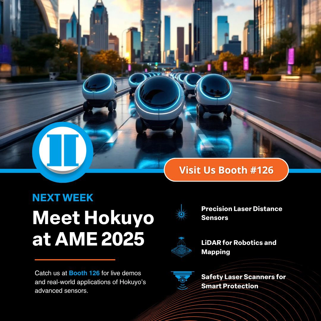
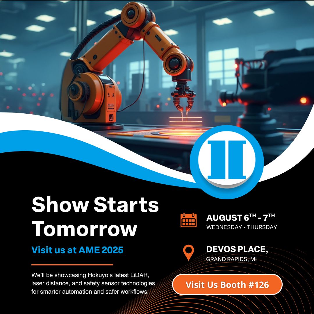
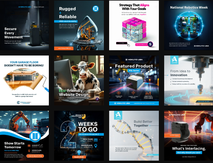
Extended the design system across marketing and sales materials to create a consistent brand experience across digital and physical touchpoints.
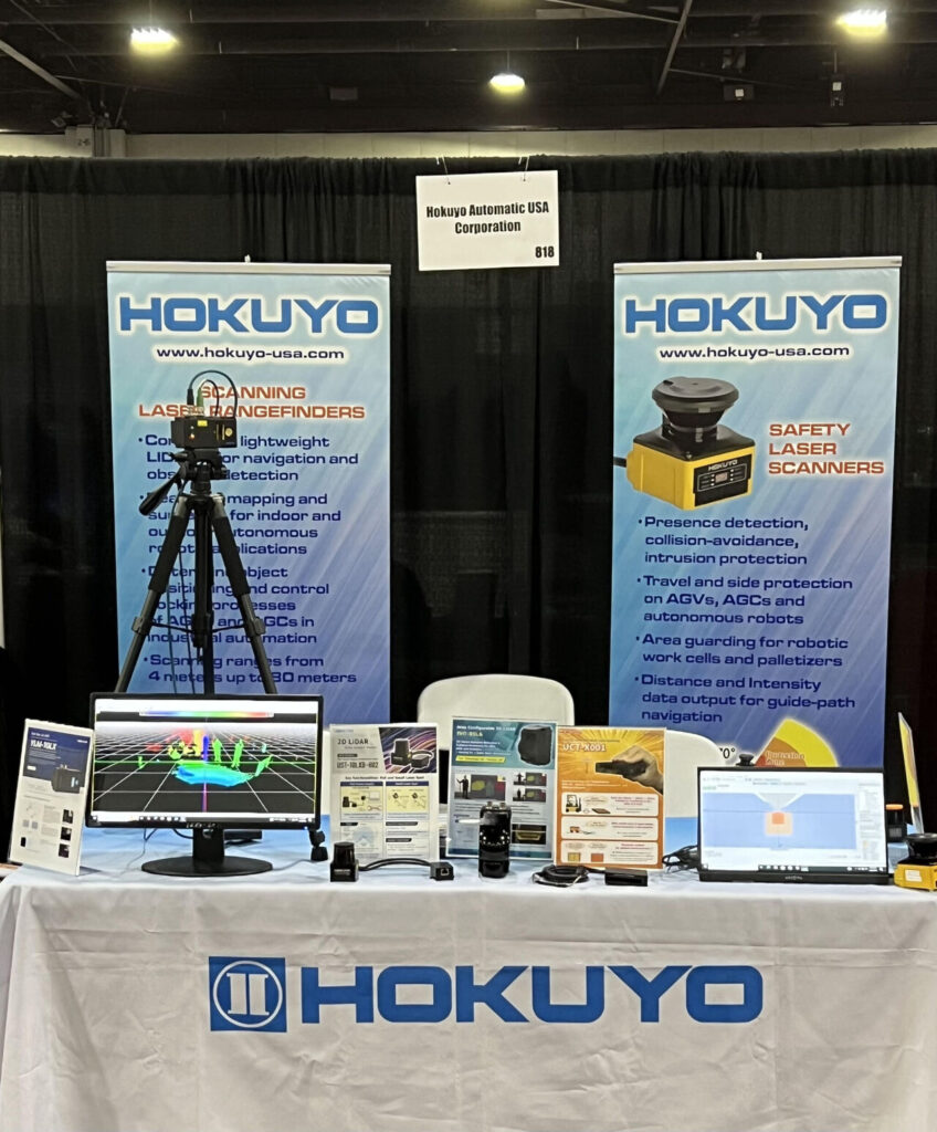
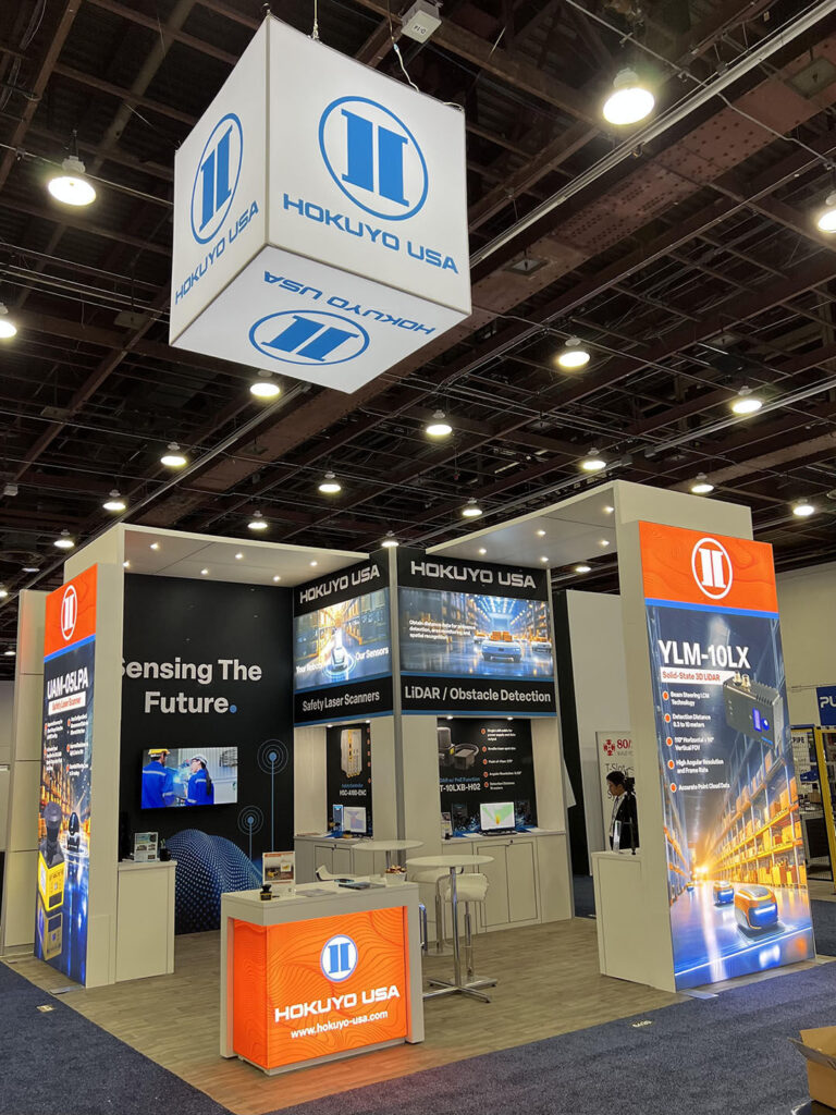
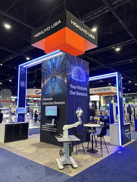
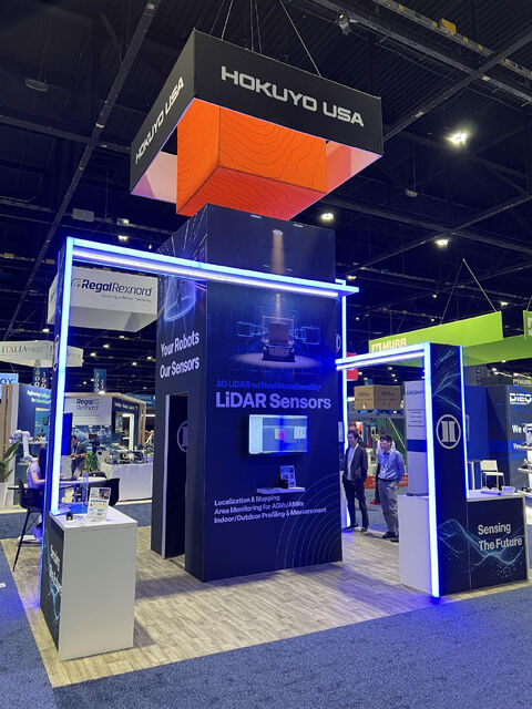
Tradeshow branding
The tradeshow experience extended the digital design system into a physical environment, reinforcing brand consistency while clearly communicating product value in high-traffic, time-limited settings.
Before
After
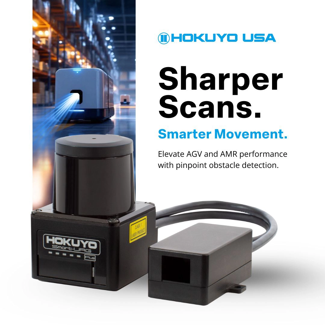
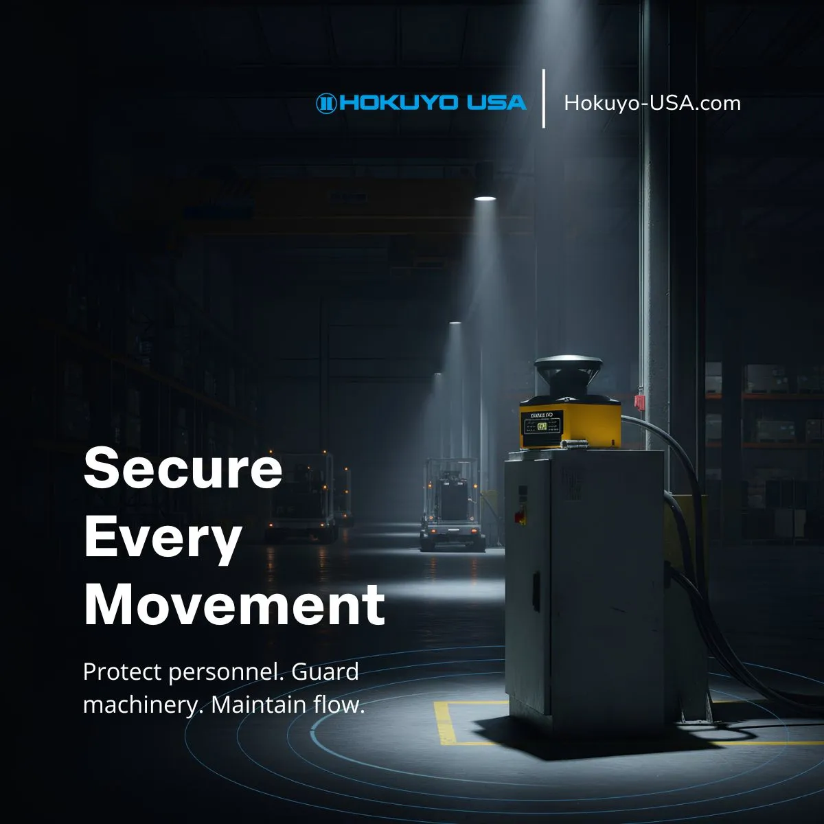
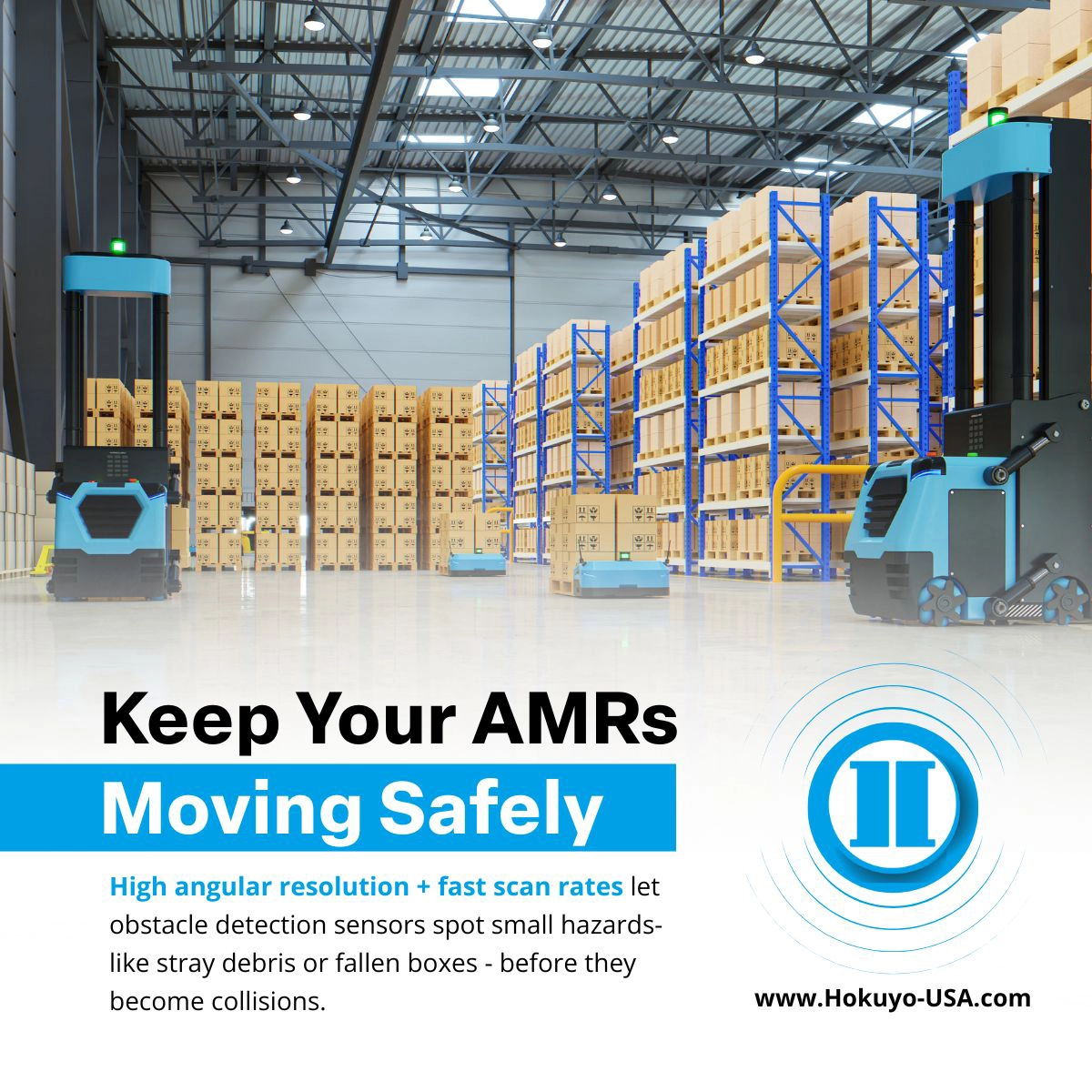
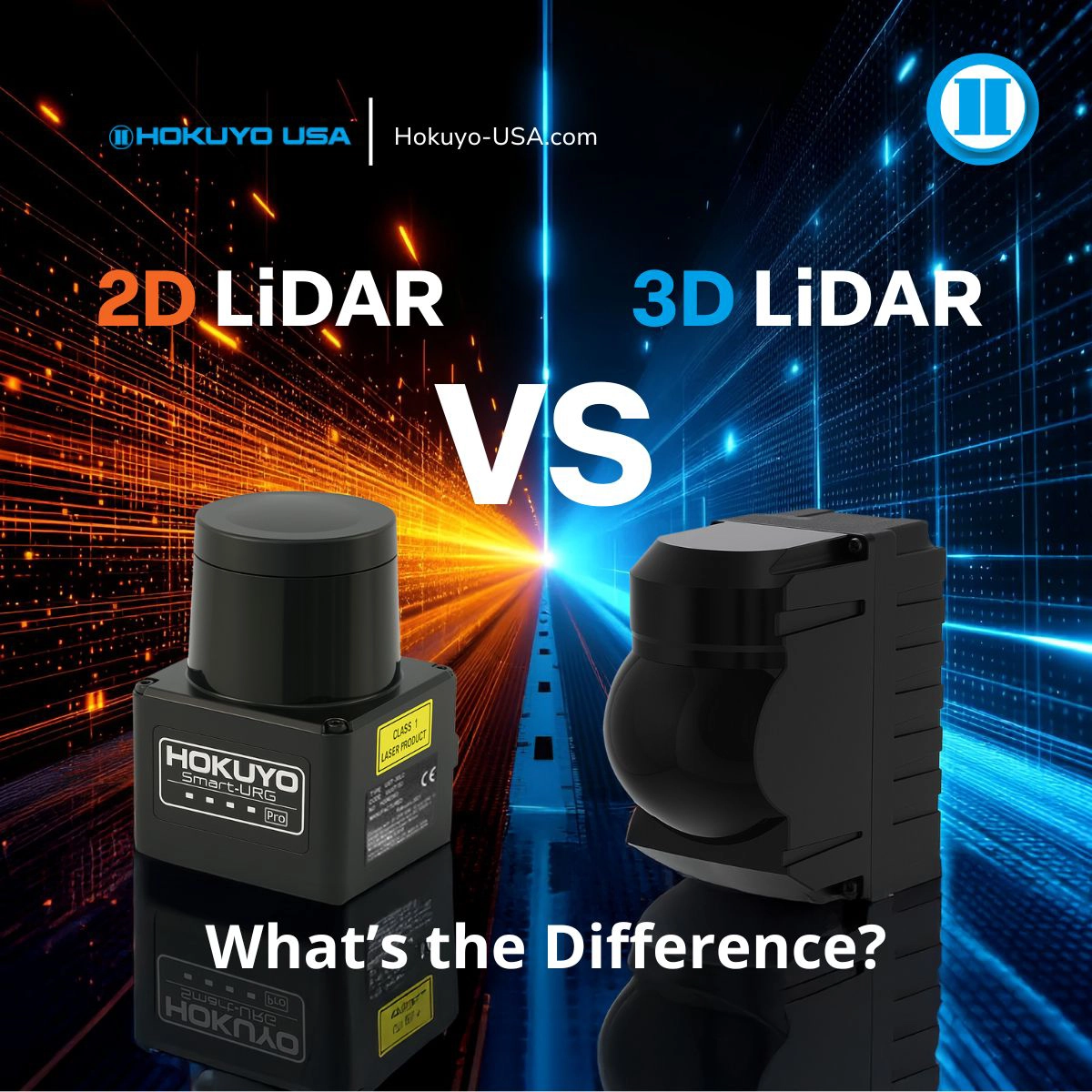
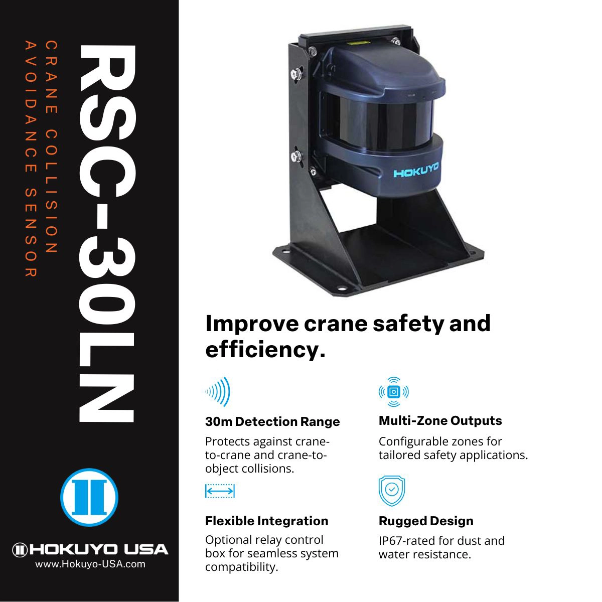
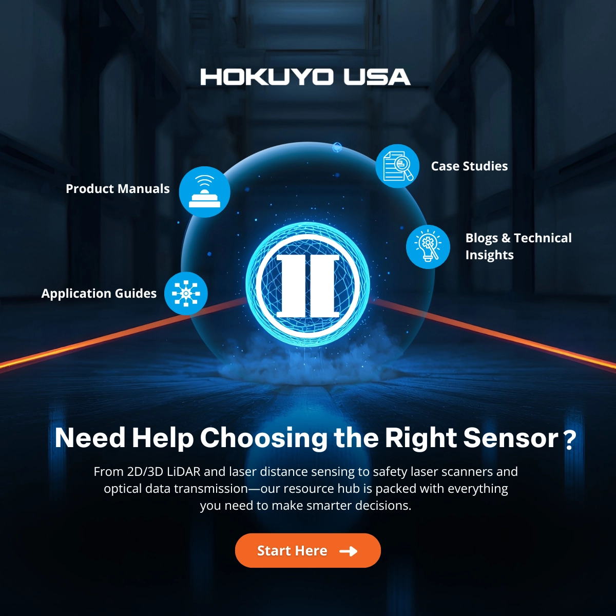
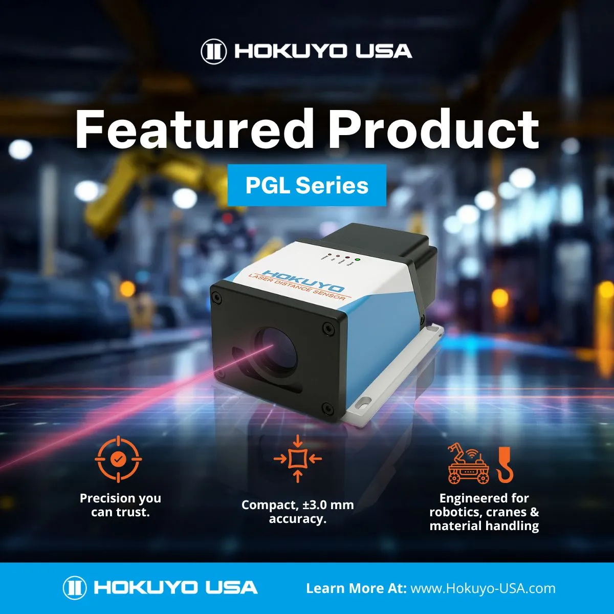
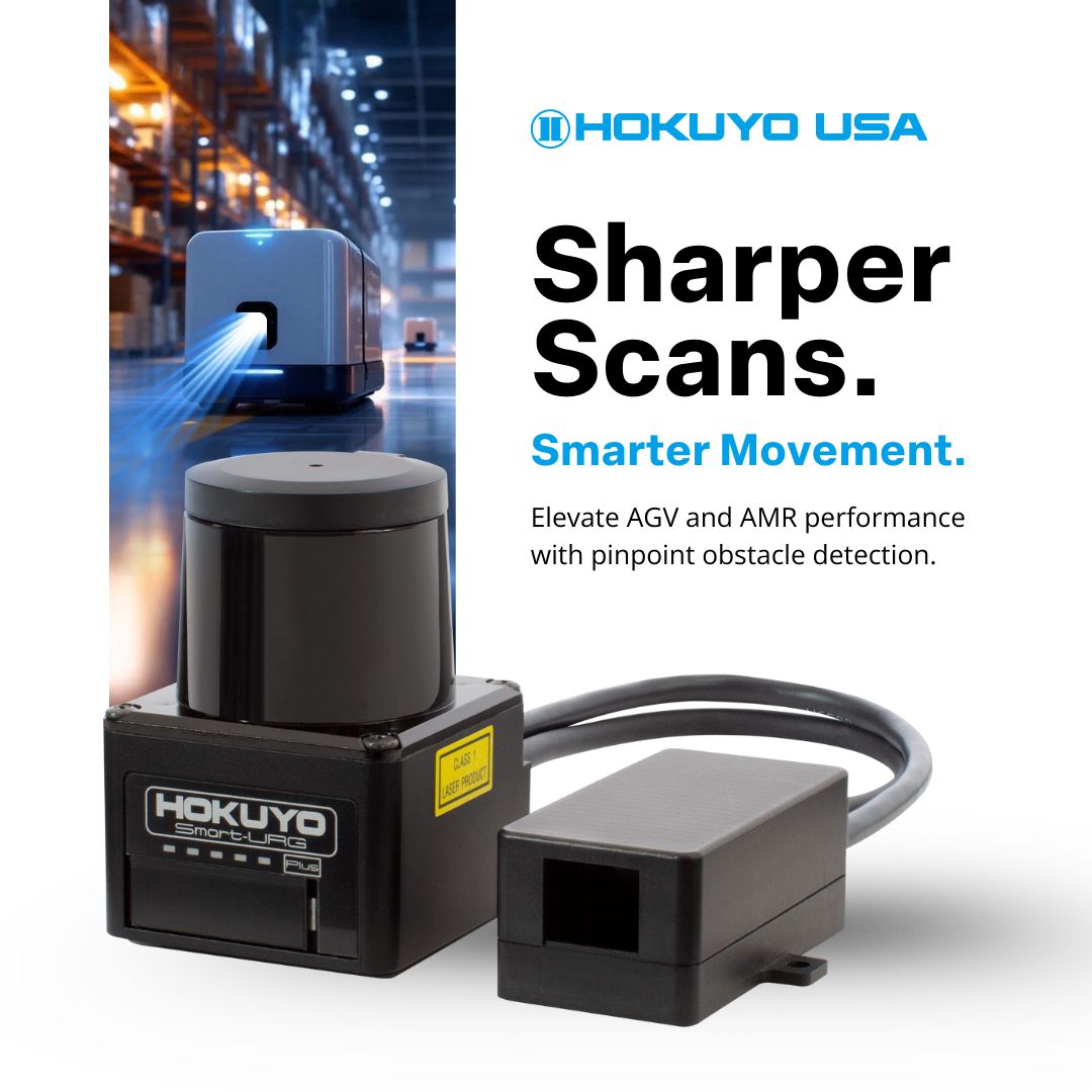
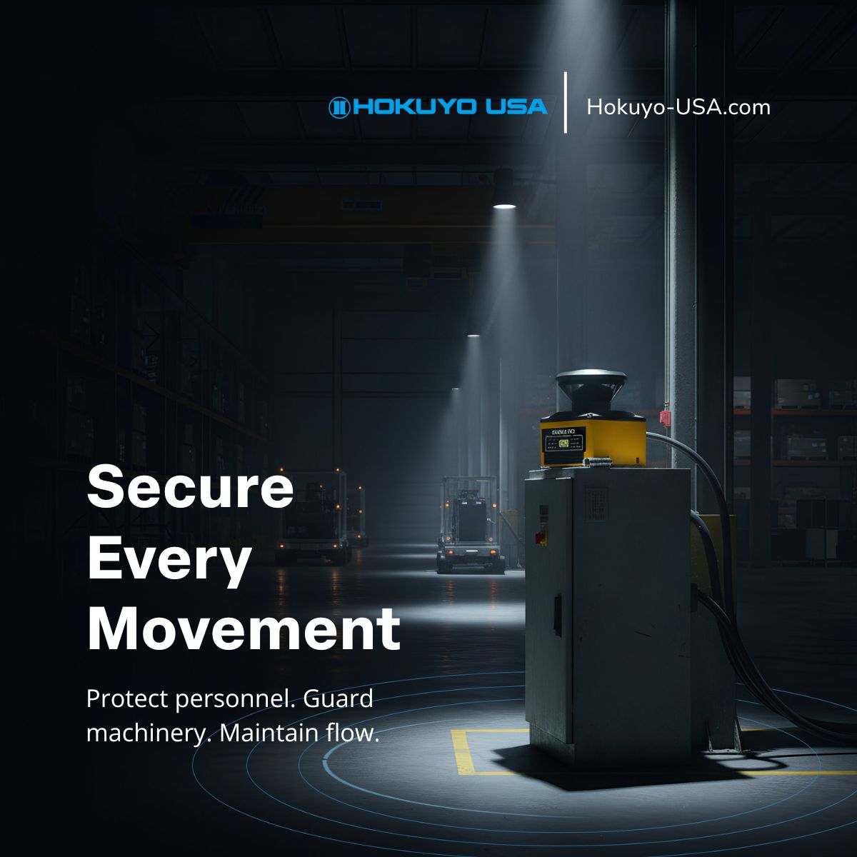
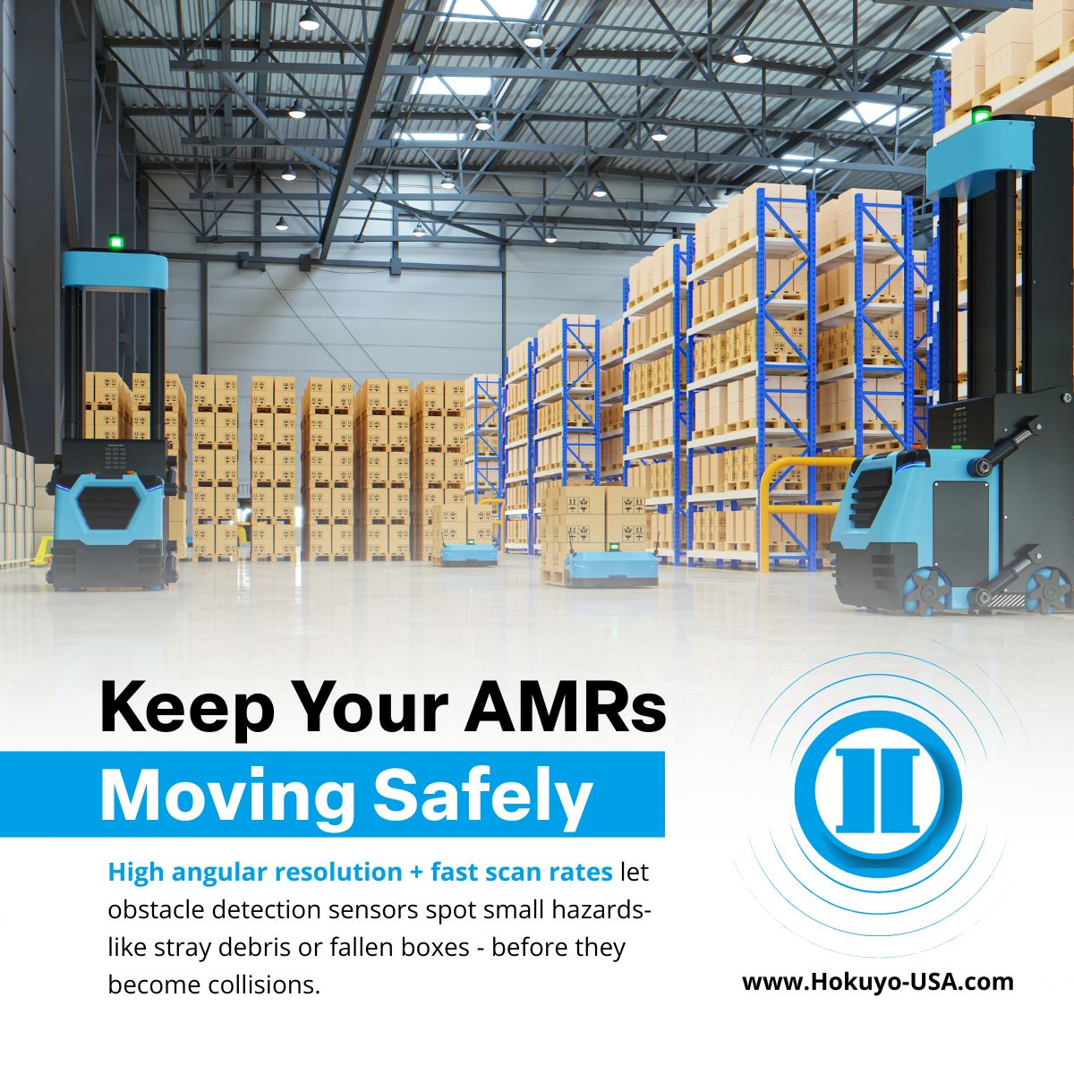
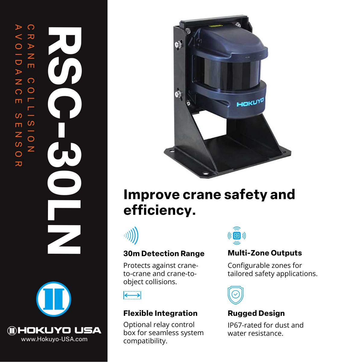
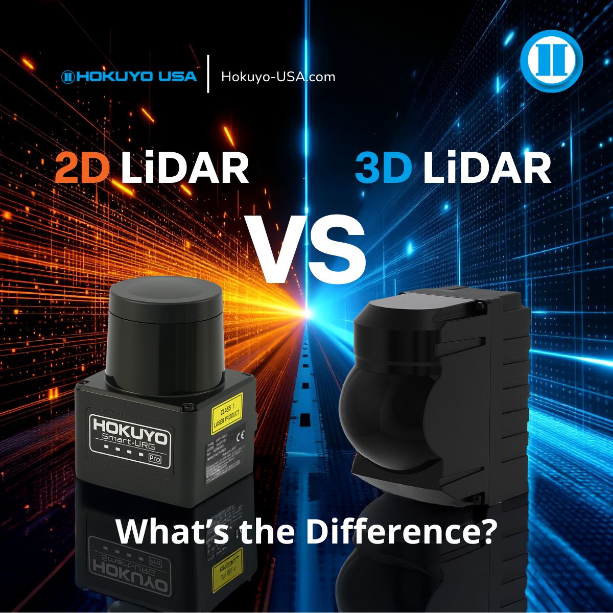
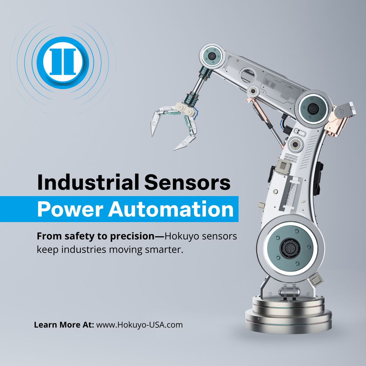
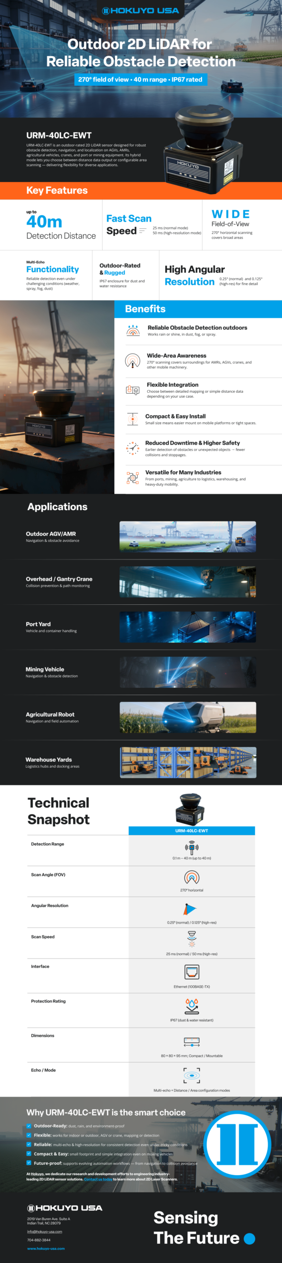
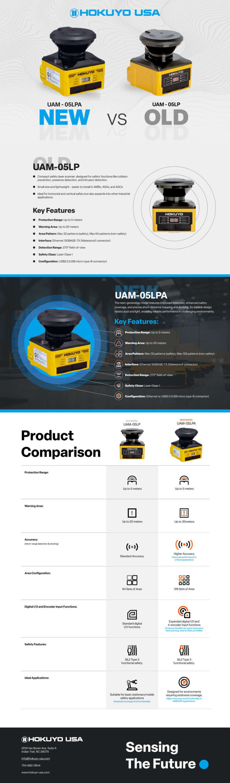
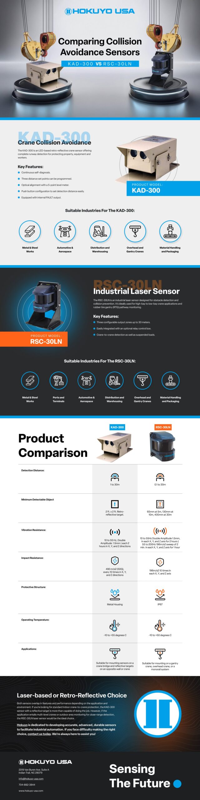
Product infographics
These infographics translate dense product and application information into accessible visual narratives, helping users quickly grasp functionality, benefits, and use cases.
Impact & Outcomes
From Fragmented to Functional
The redesign transformed a fragmented, technical-heavy experience into a structured system that improves clarity, reduces decision friction, and helps users more confidently identify the right solutions.
Key Outcomes
- Simplified complex product information into scannable formats
- Reduced friction in product discovery and navigation
- Strengthened alignment between products and real-world applications
- Created a scalable foundation for future growth
Reflection & Key Takeaways
System level improvements
This project reinforced the importance of system-level thinking, clear hierarchy, and continuous validation when designing for complex, technical products.
What Worked
Prioritizing information hierarchy early significantly reduced complexity and improved how users navigate and evaluate solutions.
Key Tradeoffs
Balancing technical depth with clarity required structuring content carefully to avoid overwhelming users while still delivering critical detail.
Looking Back
Further improvements could include enhanced product comparison and deeper application-level guidance for more advanced users.
Explore More
The Dealer Portal Experience
UX/UI Design | Information Architecture | Prototyping
View All Work
UX Design | Graphics | Motion | Video | Events
Let's talk about a project
I’m here to guide you through the entire process, from the initial idea to the final completion, in a quick and deadline-driven manner. I’ll work with you every step of the way to ensure that we meet all of your project requirements and deliver high-quality results within your desired timeframe.
Clear Hierarchy for Specifications
Typography, spacing, and layout rules were intentionally defined to surface critical technical information first—allowing engineers and decision-makers to scan, compare, and validate product details with confidence.